Ferro Time Master 70 Silver
A Big and Beautiful Contradiction
May 16, 2025
Well hello there vintage horological beauty! It seems we’re about to take a trip about five decades in the past today and bask in the glory days of watch design which has marked a whole generation of brands and collectors. As you know, the 1970s were mostly wild in terms of design and fashion for all things we humans create, from shoes and telephones to furniture and, apparently, timekeeping devices as well. But I will already tell you—because I know you’re wondering—the Ferro Time Master 70 is not just a good looking watch, subjectively speaking, but also a robust and mechanically modern time-indicating machine. So this model is not solely an exercise in design but also one in revisiting aesthetics of the past—like your mum’s jeans, for better or worse—whilst making a reliable, legible, and comfortable watch to wear. And that’s basically what this review will be about: vintage aesthetics and everyday wear.
So today we’re also taking a first look at Ferro & Company, the Canadian-based brand thus far showing a hyper-focused dedication to vintage designs. (I’ve had my eye on Ferro for a couple of years so I’m happy to finally write about it.) Ferro has quite a complete catalog and what instantly drew me to it is the relative affordability of its collections, ranging from $455 to $775 USD, as well as its variety—racing-inspired chronographs and time-only watches, avant-garde everyday models as well as something in-between—the Time Master. And as far as I can tell, all of its collections have unique designs which is always a plus for me. But before we get too deep into it, know that the Time Master comes in four dial colors—Silver, Orange, Salmon and a currently sold out Blue. As always, I’m glad to be reviewing the monochromatic version!

Specifications
We’re all guilty of judging a watch by its design and I will admit I didn’t expect the Time Master 70 to be a practical, legible, and solid timepiece. I wanted to review it, first and foremost, on the merit of its appearance although I’m not generally excited about 1970s aesthetics. But I thought and knew this could be of interest to you and so here we are. The first piece of information I would like to share about it is the bracelet and clasp combo (I know, not the typical spec to start with,) as it is, in and of itself, the perfect representation of what this watch is—a big and beautiful contradiction. The hyper vintage-looking monobloc links are held together with split pins which are wrongfully regarded by watch snobs as being cheap (they make it possible for the links to be thinner and lighter,) whilst the clasp looks resolutely modern and is built so with an on-the-fly micro-adjustment mechanism.

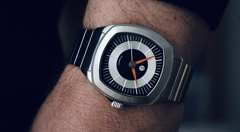
This already indicates that Ferro & Company cares about the wearing experience, just as much as it cares about how the watch looks. And the Time Master 70 wears superbly well on account of having a thin profile and a mostly rectangular case, which helps the watch settle in on the wrist. In terms of dimensions, the diameter is 39mm, the lug-to-lug 47mm, the thickness 10.4mm and we find a 20mm lug width. So it wears extremely well on my 6.50”/16.5cm flesh-and-bone apparatus as you can tell from the photos, and not only is this true from a technical standpoint but also from a design one as we will later see. The modestly-sized crown (6mm) screws-down, the case-back is see-through and screwed in, and together we get a more than decent 100 meters of water resistance which again shows that the brand cares. Both the top and rear crystal are made of sapphire.

And the Ferro & Company Time Master 70 also has what you need to read the time at night as the hour and minute hands, as well as the tip of the seconds hand, are coated with an orange SuperLuminova, whilst the printed hour markers are made of BGW9 in their entirety. (Plus the other section of the seconds hand.) That is yet another element which further indicates that the brand is about creating modern-made vintage-looking watches. In terms of movement, we find a time-only Japan made Miyota 9039 caliber (4Hz/42 hours of power reserve) which come with two major benefits: they run well out-of-the-box and are slim—3.90mm in height compared to a Sellita SW200’s 4.60mm and a Seiko NH38A’s 5.32mm. Less than 1mm can seem like peanuts but makes a whole world of difference when taking into account how it impacts the internal case architecture. Shipped on the stainless steel bracelet, the Time Master retails for $650 USD.

Design
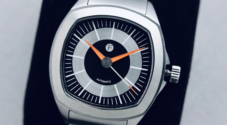
As much as the Time Master 70 is technically sound, it is even more so of this adjective from a design perspective, and that’s coming from a lover of monochromatic tool watches. And there are two elements of its appearance which dominate the rest of the watch: the orange accents on the hands and the case shape. And the former isn’t just about slapping orange lume on the hands, as the hands have a deceptively complex design and construction, for the hour and minute hands have recessed center sections where the granular-textured lume is deposited, while the outer sections have a lacquered finish. The seconds hand, for its part, has a dual lume application, with BGW9 occupying 80% of its surface and orange the remaining 20%—give or take. And of note is that the transition between the two colors of lume is spotless, which isn’t always the case even as found on more expensive watches. A first design detail which shows yet again a great attention to detail.

And so the latter, the case, has predominantly rectangular profile, actually I would say a squaround one (between square and round) where long and curved lines make the majority of the shape of the case, that is the four corners of the fixed bezel and of the case, which are almost invisible when looking at the stainless steel body from the side. And it appears that the 12 and 6 o’clock sides of the bezel have pointed middle sections, while the side ones don’t, and that the custom-made sapphire crystal showcases the same construction particularities. (To be fair, everything about the Ferro Time Master 70 is custom-made.) What I find perhaps the most fascinating about the case is the fact that its corners perfectly match the shape of the bezel, and that the geometrical character of the case flows down into the lugs and short crown-guards. The superb case geometry is finalized by a few mirror-like polished accents.

I must say I’m quite in awe with what Ferro & Company has accomplished here and now I want to review more of their models.
But there is more and that’s the dial. And we find many lines on the case, a certain sense of speed and movement, made possible not only by the pointy hour and minute hands, and the straight seconds hand, but also by the long printed hour markers which begin at the edges of a center black circle and end at the farthest corners of the dial. The outer and center sections of the dial are therefore black and come with a fine matte finish, whilst sandwiched in-between we find a radially brushed gray section which has a pearlescent finish to it. The juxtaposition of colors and textures appear seamless with the naked eye and looking straight down at the dial, but becomes alive when looking at it a bit closer and at even the slightest of angles. The Time Master 70 is, obviously, well thought out from design and technical perspectives and that is why I thought—I knew—you would want to hear about it.

The Heart of the Matter
So at the heart of the matter is the fact that the Ferro Time Master 70 is indeed a big and beautiful contradiction. But not in the way I originally thought—that of looking vintage and being built like a modern watch—but rather in the fact that it was supposed to be made in the 1970s but was in fact born five decades later. Let me explain. There are many watches which are designed and fabricated today to look like vintage timepieces. They generally borrow key design elements from old and iconic designs—TV-shaped cases, bright colored dials, thin and elongated hands—which are paired with modern tech. So they look like 1970s watches but made in the 21st century. Here the Time Master looks like it was designed and made in the 1970s although it is equally modern on account of the sapphire crystal, the Miyota 9039, and the strong presence of lume—and the high quality of the manufacturing and finishing matches its modern aspect.

In other words, the Time Master is an old school spirited vintage-looking watch and its unique character stems from the myriad of design and technical nuggets Ferro endowed this model with. It has the attention to detail which I believe was more common in the 1970s.

Conclusion
I know all of this sounds a big or hugely contradictory and I’m sorry. Or I’m not. What is sure is that the Time Master is superb and surprising. Looking at the professionally done photos of the watch on the brand’s website, I liked the design but I had no idea it was so compelling in the metal. It was impossible to see the subtle play on textures, the fine print of the hour markers, or even the three-dimensionality of the yet-to-be-mentioned applied logo. The tiny polished accents on the upper sections of the crown-guards, the tainted rear crystal, and the capped pinion in the shape of an old car speedometer—again elements I didn’t mention—all come together nicely to make the watch. Which is why my conclusion is of contradictory nature but again, what is sure is that this watch is superb.
As a reminder, the Ferro as presented here on the stainless steel bracelet will set you back $650 USD which is, to me, not enough money for what you get. There I said it. And if you don’t like Silver, then you will probably like Orange or Salmon.
Thanks for reading.


