Camp Watches Fieldtimer Malaga Red
Bold. Visually & Physically So.
May 30, 2025
by Vincent Deschamps
If this isn’t your first visiting the Mainspring Watch Magazine, then you know field watches are much beloved here. Time-only watches, generally speaking, are fascinating because they represent a distilled yet pragmatic way of showing time. Not as drastically boiled down as single-hand watches do, or those whose dials are deprived of any kind of markings, in which cases time is more of a construct and less of a reality we want to track and display. So field watches are even more so fascinating for they exist(ed) to indicate the precise time as quickly as possible. They are (were) tools of the purest essence when we look at the entire world of horology since the dawn of scientific times. And so it seems and some believe that field watches are eternal and the most difficult genre of timekeeping devices to reinvent throughout the generations. Because the simpler something is, the more difficult it is to recreate it.
So it is a challenge for a watch brand to come up with a new design for a field watch. It is even more so challenging when we’re talking about a brand that just got started because it isn’t safe to do so—but necessary in order to demarcate itself from the vast competition. And to speak more frankly, it needs to stand out in the ocean of terrible horology we see nowadays crowd the marketplace. Today’s protagonist therefore is Camp Watches created by Justin Jakobson in California and we’re taking a look at the Fieldtimer Malaga Red, visually the opposite of what I normally like to see in a tool watch, which is why I had to get hands-on with it. If new horological entrepreneurs dare giving us something new and sprinting off the beaten path, then I owe it to them to also venture outside my comfort zone and challenge my own personal and deeply-rooted preferences. And you know what? The Fieldtimer is excellent.

Specifications
This Camp watch at first didn’t strike me as being as serious of a field watch as it actually is. This unfortunate observation came from a preliminary quick glance at the dial which isn’t common, erring on the side of avant-garde design more than that of the practical and military ones I often lean towards. And because we should never judge a watch by its dial, it is necessary to dig deeper, first into its specifications of the Fieldtimer as there is plenty to talk about, including a couple of elements which are intimately linked to the design, and second into the latter which is nothing short of a beautiful statement. The first element which sets the Fieldtimer apart from the myriad of field watches that exist on the market today is the dial. 1.3mm in thickness totalizing 15 layers of hand-applied enameled lacquer* made by Berlac, a Swiss company founded in 1928 which specializes in lacquers and coatings.

I find this interesting for two reasons. First because Justin went out of his way to equip his first collection with a bespoke dial and second, because he indicated where it is made. Although many of us who gravitate within the micro/independent side of the watch market are genuinely nice folks, there is a certain secrecy as to where brands get their watches made, whether it is in continental Europe or in the Far East. We can command Justin for this first bit of transparency which goes a long way in getting us watch enthusiasts to buy into the brand. Moreover, he opted for another Swiss component for the Fieldtimer, a manual-wind Sellita SW210-1b (4Hz/42 hours of power reserve,) which is adjusted in 2 positions to run at +/- 12 seconds per day and whose train wheel bridge (I had to Google that) is custom-engraved for Camp. Typically when brands use manual-wind calibers they don’t bother with that step.

The advantage of enamel dials, when they make it out alive of the tedious manufacturing process, is that they don’t tarnish over time which is a positive for a field watch we are meant to use everyday for the rest of our mortal lives. So it makes sense to find other elements which would make it possible to wear the watch for that much time, for example a top-hat double-domed sapphire crystal with inner anti-reflective coating, 100 meters of water resistance (screw-down case-back and triple-gasket push/pull crown,) lumed hands and markers, and three options of fastening apparatuses—a thick Italian leather strap, a Cordura nylon strap, and a stainless steel Bonklip. You got everything you need in a neat little package. Add to that a modern-sized case of 39mm in diameter, 47.2mm lug-to-lug, 10mm thick, and 20mm lug width, and you’re pretty much all set for any and all adventures you might engage in.
*The predecessor to the 1959 Seiko Alpinist, the Laurel, was a field watch with an enamel dial. Just putting it out there.

Design
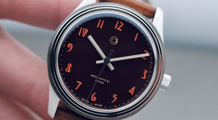
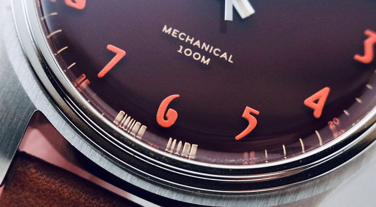
So let’s now dive into what provoked an ill reaction when I first saw the Camp Watches Fieldtimer: its design. And the reaction I had, and which I am not proud of, acts as a reminder that we should get hands-on with watches as much as it is humanly possible to do so. And we ought to do it first because the watch can be well executed even though we aren’t moved by its appearance, and second because images, even the best of them, don’t tell the full story. (Which is why I write lengthy reviews.) The aforementioned enamel lacquered dial is amazing to look at up close, as it is flawless and that the multiple layers of lacquered enamel make it so the printed information appears to be ever so slightly floating above it. It seems as though there is a thin layer of transparent coating on top of the enamel which the numerals, minute track, and branding are printed on. Or is that what a lacquered enamel entails?

A possible rhetorical question which leads us to studying the actual dial design.
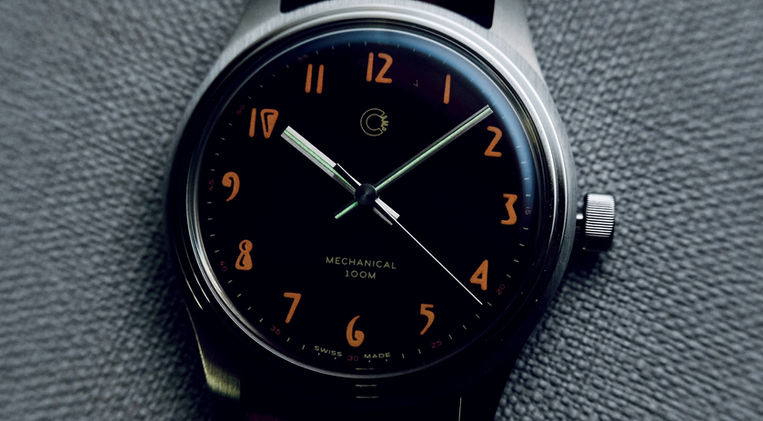
For the hour numerals, Justin found inspiration in a 1940 Ford Coupe, more specifically in the typeface used on the gauges of the dashboard (see picture below,) which most intensely contributed to my initial judgment of the Fieldtimer but which I now find superb, either thickly printed or applied, and painted in a red SuperLuminova which up close has a granular texture. (Luminescent paint always comes with such texture.) The hour markers are juxtaposed by smaller numerals indicating the 5-minute increments, fully spelled out for symmetry sake, and complemented by finely printed minute hashmarks. Below the twelve we find the brand logo and below it the words “Mechanical” and “100m” which is exactly the type of text I want to see on a field watch. (You don’t need to convert the depth rating to feet.) And the hands took me by surprise: it’s the first time I see baton-style hour and minute hands which continue on the other side of the pinion which is a great look.

Justin’s attention to detail flowed as naturally into the case which comes with a rather unique profile and a major trick up its lugs. A significant portion of the latter and of the mid-case were made into a polished chamfer, which makes it appear as though the mid-case is floating above the wrist. There is nothing gimmicky about this as I said to myself, upon first inspection of the watch, “this case is oddly flat.” I also thought something was missing, or amiss, and this impression can be fully attributed to the angle at which the chamfer cuts into the lugs and how the lugs are endowed with three additional facets: from the mid-case, on top, and on their outside. And Justin had fun alternating horizontal and vertical brushed treatments with polished ones. I don’t know about you but the uniquely shaped lugs make me think of the bow of an aircraft carrier. This design element is complemented by a thin step bezel which climbs to the top-hat sapphire crystal.

The Heart of the Matter
Yes, the Camp Watches Fieldtimer is bold visually and physically so. There is more to this design and manufacturing that meets the eye, a revelation one can only have by studying the watch up close. And all elements of both categories which at first made me hesitant to want to know more about this model are what, in the end, convinced me to do so. I know this sounds extremely contradictory because it is. But understand this: our natural reaction when we see something new and different is to dislike it because it doesn’t fit the image we have created of who we are and what we like. I see myself as a die-hard military and (classic) tool watch person and so I couldn’t see myself liking the Fieldtimer. But I’m also a self-proclaimed horological journalist and as such it is my responsibility to string together too many words to tell a story about a watch which is interesting, either visually or mechanically so.

At the heart of the matter then is the fact that Justin Jakobson created a unique field watch and that most of what you see in it is original. (Step-bezels aren’t unique to Camp.) From the deep Malaga Red color of the dial—which I strangely haven’t mentioned until now—and the art-deco numerals to the sharp and visually striking case to the massive and three-dimensional buckle which I haven’t also mentioned because there is too much to talk about, as I indicated there would be. Beyond the way it looks and what it is made out of, the Camp Watches Fieldtimer also offers incredible value for what you get as it will set you back $900 USD which includes, as a reminder, two straps and a bracelet. I don’t know—I don’t undertand—how Jacob can earn much running Camp given the intricacy of the dial and of the quality of the movement, as well as the blanket outstanding execution of all parts of this watch.

Conclusion
The Fieldtimer exists in three versions: Malaga Red, Florida Green, and Atlantic Blue. Each version comes with its own typeface and minute changes in the minute track design and the color of the seconds hand. But they are all made out of the same good stuff. So by studying the Fieldtimer from all angles and by ignoring my little inside voice telling me to stay clear of this model, I proved to myself once again that all watches deserve to be looked at globally and with curiosity. They need to be judged on the merits of their design and specifications even though they do not resonate with me personally as strongly as others do. But I’m a fan of field watches and of micro/indie brands, and so I’m glad to have spent some quality time with the Fieldtimer.
Please take a moment to look at Justin’s work here as he made the bold move of getting started with a first collection which comprises many unique visual and technical aspects. It’s a thing of its own.
Thanks for reading.


